Understanding WCAG 2.2 Success Criterion "1.3.1 Info and Relationships"
November 3, 2024
This article provides an overview and personal insights on how to achieve "1.3.1 Info and Relationships", a Success Criterion included in the Web Content Accessibility Guidelines (WCAG) 2.2. For precise details about the Success Criterion itself, please refer to the original document.
Web Content Accessibility Guidelines (WCAG) 2.2 defines how to make Web content more accessible to people with disabilities. Accessibility involves a wide range of disabilities, including visual, auditory, physical, speech, cognitive, language, learning, and neurological disabilities
What is Success Criterion "1.3.1 Info and Relationships"?
WCAG 2.2 Success Criterion 1.3.1 Info and Relationships is a Level A success criterion that emphasizes the importance of presenting content in a structured way so that its meaning and relationships are clear to all users, including those who rely on assistive technology.
This criterion focuses on ensuring that information is conveyed through semantic relationships, not just visual cues, so that it can be accurately interpreted by screen readers and other accessibility tools.
Intent
The intent of this Success Criterion is to ensure that content structure and relationships conveyed visually or audibly remain clear and accessible when the presentation format changes.
Information is structured and relationships are created using various visual and auditory cues. For visual representation, headings are often in a larger, bold font. In auditory representation, a change in voice pitch or speech rate may be used to emphasize important information.
These structures and relationships should be clear and understandable for all users, no matter their sensory abilities.
It is strongly encouraged that information and relationships be programmatically determined. If that's not possible, alternative text or other effective methods should be used to share the same information.
Benefits
- This Success Criterion helps people with different disabilities by allowing user agents to adapt content according to the needs of individual users.
- Users who are blind (using a screen reader) and deaf-blind using braille (text) refreshable displays benefit when information conveyed through color is also available in text.
How to test 1.3.1 Info and Relationships
Automated Testing
Ensure that the following errors do not appear in axe DevTools or Accessibility Insights:
- aria-hidden-body: Ensure aria-hidden="true" is not present on the document body.
- aria-required-children: Ensure elements with an ARIA role that require child roles contain them.
- aria-required-parent: Ensure elements with an ARIA role that require parent roles are contained by them.
- definition-list: Ensure
<dl>elements are structured correctly. - dlitem: Ensure
<dt>and<dd>elements are contained by a<dl>. - list: Ensure that lists are structured correctly.
- listitem: Ensure
<li>elements are used semantically. - td-headers-attr: Ensure that each cell in a table that uses the headers attribute refers only to other cells in that table.
- th-has-data-cells: Ensure that
<th>elements and elements withrole=columnheader/rowheaderhave data cells they describe. - p-as-heading: Ensure bold, italic text and font-size is not used to style
<p>elements as a heading. - heading-order: Ensure that the error "Heading levels should only increase by one" does not appear.
- table-fake-caption: Ensure that tables with a caption use the
<caption>element. - td-has-header: Ensure that each non-empty data cell in a
<table>larger than 3 by 3 has one or more table headers.
Note: Please refer to the official usage guides for more information on how to use these tools.
Manual Testing
1. Ensure that headings (<h1> to <h6>) are used in a proper hierarchical order to maintain logical structure and accessibility.
Bad
<h1>Title 1</h1>
<h3>Title 3</h3>
<h2>Title 2</h2>
<h4>Title 4</h4>
Good
<h1>Title 1</h1>
<p>Body 1</p>
<h2>Title 2</h2>
<p>Body 2</p>
<h3>Title 3</h3>
<p>Body 3</p>
2. Ensure that appropriate HTML elements are used for tables and lists such as <table>, <ul>,<ol>.
Bad
<!--List-->
<div>
  * foo<br />
  * bar<br />
  * baz
</div>
<!--Table-->
<div>
  <div>Name: John Doe</div>
  <div>Position: Software Engineer</div>
</div>
Good
<!--List-->
<ul>
  <li>foo</li>
  <li>bar</li>
  <li>baz</li>
</ul>
<!--Table-->
<table>
  <thead>
    <tr>
      <td>Name</td>
      <td>Position</td>
    </tr>
  </thead>
  <tbody>
    <tr>
      <td>John Doe</td>
      <td>Software Engineer</td>
    </tr>
  </tbody>
</table>
3. Ensure that the correct HTML elements are used for different types of UI components:
- Use
<button>for clickable elements. - Use
<a>for links. - ...
Bad
// Button
<div onClick={handleClick}>Click me</div>
// Link
<div onClick={handleClick}>Go to Google</div>
Good
// Button
<button onClick={handleClick}>Click me</button>
// Link
<a href="https://www.google.com">Go to Google</a>
4. Ensure that the correct elements are used for text emphasis such as <strong>,<em>.
Bad
<div>
  <b>Important</b>
  <i>Italic</i>
</div>
<b> and <i>: These are visual-only tags that do not provide any semantic meaning to screen readers, so they are best reserved for purely decorative purposes rather than conveying importance or emphasis.
Good
<div>
  <strong>Important</strong>
  <em>Italic</em>
</div>
5. Ensure that appropriate HTML elements are used for form elements such as <input>, <select>, <textarea>, <label>, <fieldset>, <legend>, etc.
Bad
<div>
  <div>Username</div>
  <input type="text" />
  <div>Password</div>
  <input type="password" />
</div>
Good
<form>
  <label for="username">Username</label>
  <input type="text" id="username" />
  <label for="password">Password</label>
  <input type="password" id="password" />
</form>
6. Ensure that UI components are implemented using HTML semantic elements wherever possible.
- Accordion/Disclosure: Use
<details>element - Dialog: Use the
<dialog>element
Bad
// Accordion
<div>
  <div onClick={handleClick}>Title</div>
  <div>Content</div>
</div>
// Dialog
<div>
  <div onClick={handleClick}>Open Dialog</div>
  <div>Dialog Content</div>
</div>
Good
// Accordion
<details>
  <summary>Title</summary>
  <p>Content</p>
</details>
// Dialog
<dialog>
  <div>Dialog Content</div>
</dialog>
Screen Reader
We can use VoiceOver to test the accessibility of our content. VoiceOver is a screen reader built into Apple products that reads aloud the content on the screen.
Please refer to the official usage guide: VoiceOver User Guide
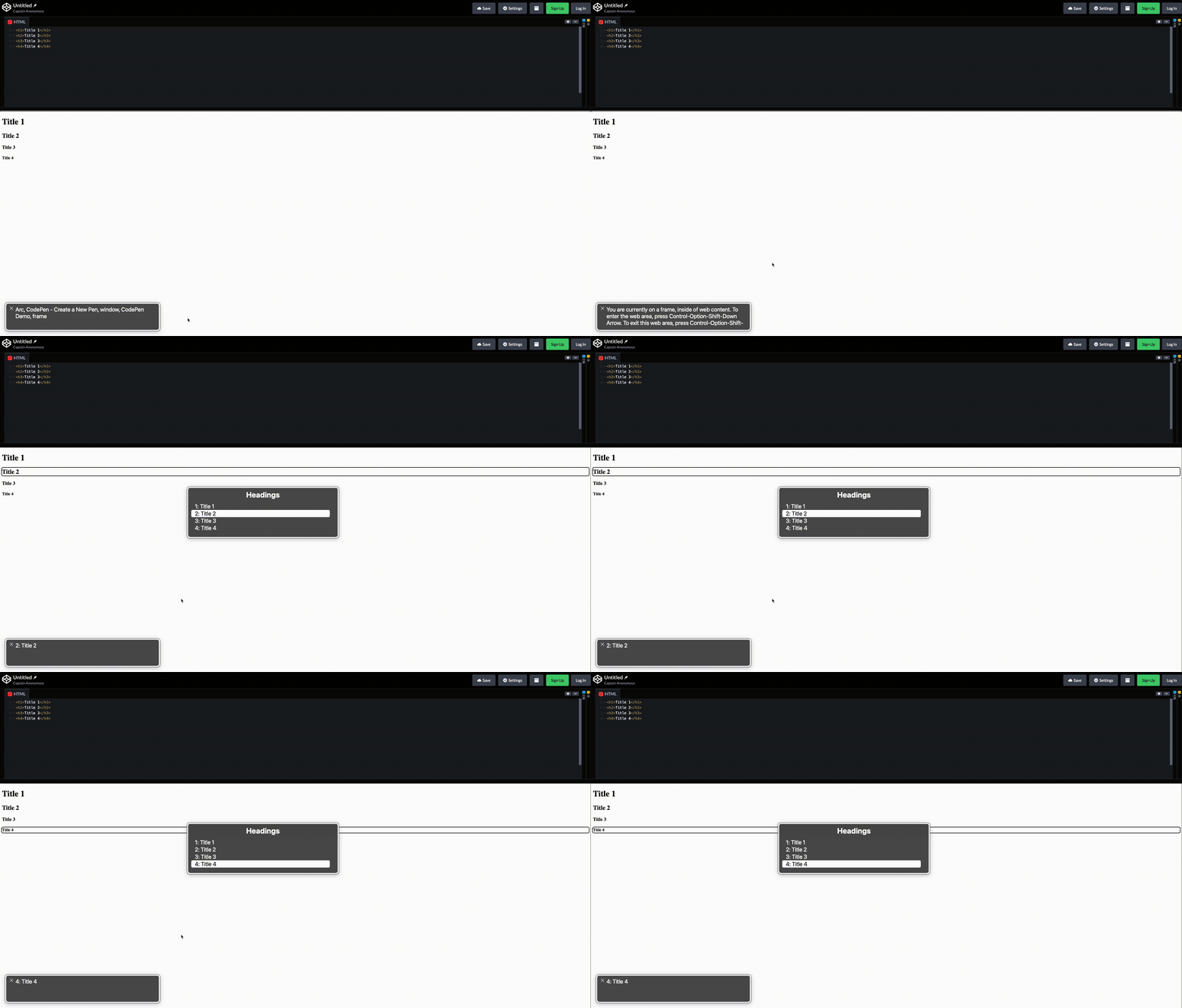
1. Ensure that the correct heading order can be verified using a screen reader.
- Press the VoiceOver modifier key (Caps Lock or Control + Option) + U.
- From there, use the left and right arrow keys to navigate the different lists available in the rotor until you get to the
Headings.
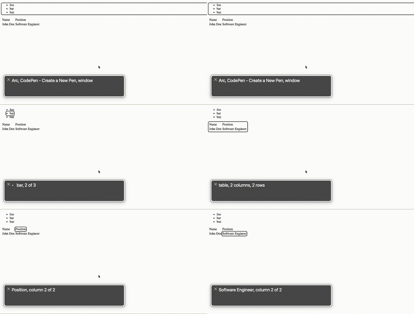
2. Ensure that tables and lists are properly recognized by screen readers.
- After turning on VoiceOver, navigate to the table or list by pressing the VoiceOver modifier key (Caps Lock or Control + Option) along with the left and right arrow keys.
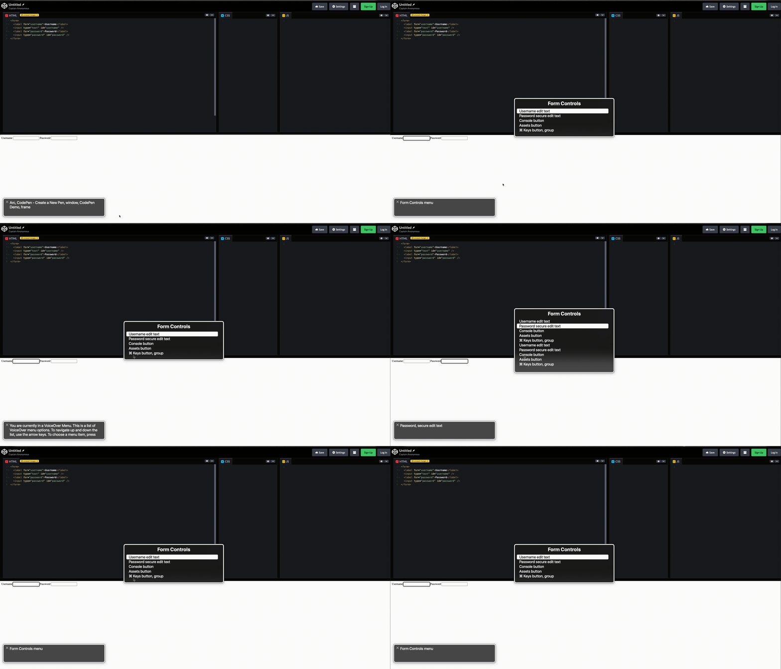
3. Ensure that form control elements are properly recognized by screen readers.
- Press the VoiceOver modifier key (Caps Lock or Control + Option) + U.
- From there, use the left and right arrow keys to navigate the different lists available in the rotor until you get to the
Form Controls.
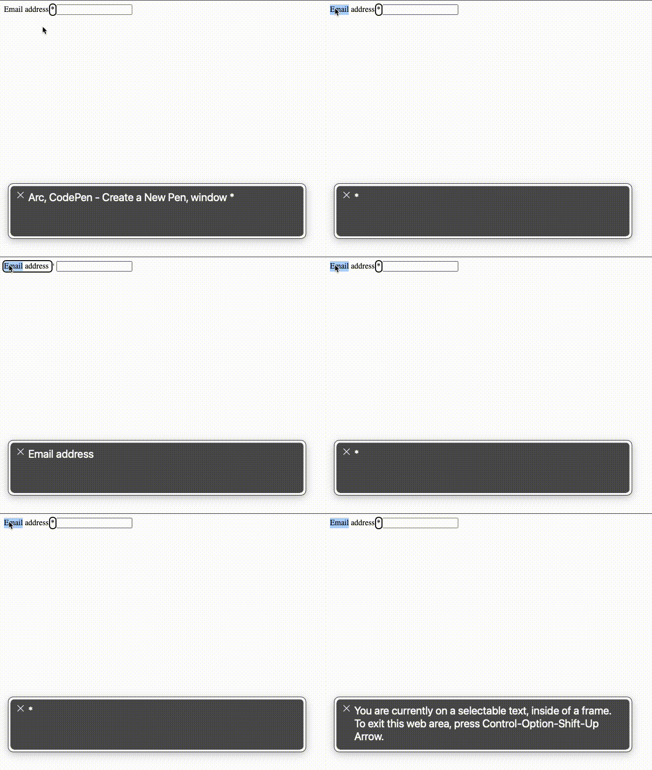
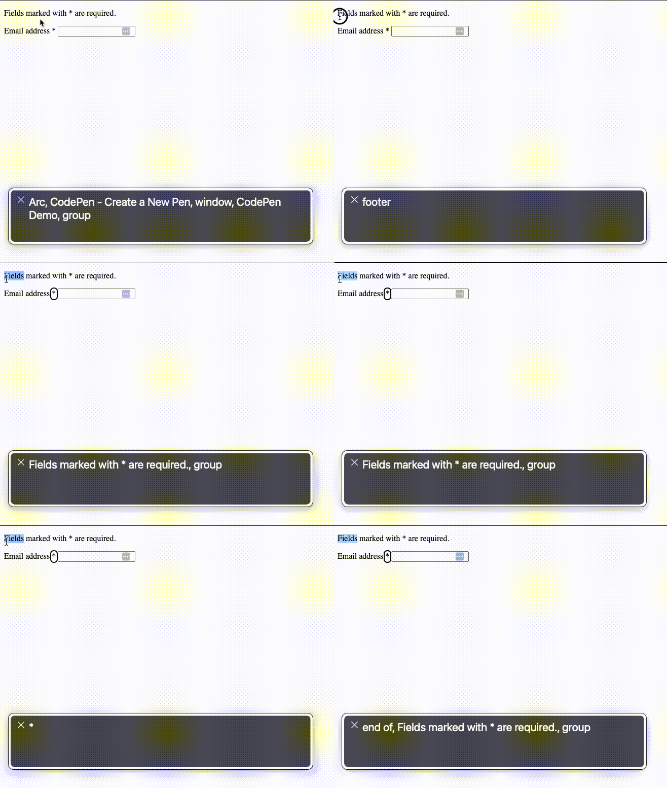
4. Ensure that the relationships between related elements are conveyed properly to screen readers.
Example: If a symbol like an asterisk (*) indicates a required field, make sure it is associated with the appropriate description text.
Bad
The asterisk in the form without description does not make sense what it intends.
<form>
  <label for="email">
    Email address
    <span>*</span>
  </label>
  <input type="email" id="email" required />
  <!--...-->
</form>
Good
Associating the asterisk with the description by using aria-labelledby can indicate it is a required field.
<p id="required-description">Fields marked with * are required.</p>

<form>
  <label for="email">
    Email address
    <span aria-labelledby="required-description">*</span>
  </label>
  <input type="email" id="email" required />
  <!--...-->
</form>
Conclusion
- WCAG 2.2 Success Criterion 1.3.1 Info and Relationships (Level A) requires that content is structured clearly so all users, including those using assistive technology, can understand its meaning and relationships.
- This Success Criterion ensures that content structure and relationships are preserved and accessible, even when the presentation format changes.
- This success criterion can be verified through various testing methods: automated testing, manual testing, and screen reader testing (such as Mac’s VoiceOver).
